Showing posts with label cover art. Show all posts

24 June 2014

Worst Romance Covers 2013

This week's instalment of Cover Cafe's romance cover competition is... Worst Romance Covers.
Last week we looked at the best - this week we're covering the other side of the scale.

This is the category that authors (myself included) dread being nominated for. When I get that email and my finger always hovers nervously before I can bring myself to open the cover art file. So far I've been able to breath a sigh of relief. These poor authors are less lucky...

The full list, first to tenth is on the Cover Cafe site, but here are a few to wet your appetite for... less.

In first place: 
The Search is Over

The scary trend for this year is started with this cover - computer generated people. I'm sorry but they all just look weird and plastic.

Sunny also wasn't impressed. "Ugh. These bad CGI art covers have to go. Maybe those two guys are supposed to look like giant latex dildos, and maybe her breasts are supposed to look like frozen hams (and what the heck, are they training her to mime an invisible wall?) But if this is the best you can do at drawing what I assume is supposed to be sexy romance, please give it up and turn to technical manuals or Japanese robot fetish fantasies."

Elyse: "Nothing says romance like a badly-dressed woman with oddly-shaped breasts being restrained from behind by hairless conjoined twins. Seriously, the bald guys are standing so close they MUST be joined at the hip, with only two arms between them. I'm pretty sure the right one also lacks genitalia, and nipples are doubtful. I'll keep searching, thank you very much."


Fourth place goes to:
Wild Things Lost

More plastic people, this time they're both wearing wigs, and what's with his expression he looks like he hasn't a thought in his head other than staring weirdly at her chest.

from Lynn P.: "You know how when you were little and played with your Ken and Barbie dolls -- and you would end up losing some of their clothes? And then you would just make do with what you had left? This cover is the result. He looks like a plastic doll -- particularly the area where his hips join the rest of his body. He also looks like what your Ken doll looked like when you decided to play beauty shop and cut his hair. She is a little bit better but still looks like a plastic doll. His stare is also really creepy."

Robin B. was rendered speechless: "I have no words...."
In ninth place:
Sweet Delight

Which really isn't much of a sweet delight. I like most of the commenter's can't get past the fake tattoo - in fact it's so bad I didn't even immediately realise it was a tattoo.

Cover Cafe's Mary Lynne: "Ah, the higher glories of the Worst category. How can I choose? Should I opt for the amateurism ofEntangled? The overly busy bodies on Perfect Mate andRetribution? The creepy android-like people of The Search is Over, On Thin Ice, and Lost? The use and abuse of babies and dogs on Baby Papers and Animal Attraction? The eerie shininess of the man's body on Desperately Seeking Fireman? They are all pretty awful. But there is just so much wrong onSweet Delight. There's the way the man's body proportions don't quite work--that torso looks a bit too Photoshopped. There's that godawful paw that's just slapped on the image. But let's face it. The guy's wearing a Speedo. In today's day and age, that earns you the worst label no matter what

In case you've forgotten, here's the winner and runner up from last year (last year's list). While there are some shockers this year - the CGI especially - I almost feel that last year was worse. So, that's got to be good hasn't it...


17 June 2014

Best Cover Competition

It's that time of year again. The Cover Cafe's romance covers competition results are in.
This week the the winner - next week you guess it the cringe contenders.

So the best of 2013 (follow links to get full list):

Avant Garde:

In First Place:
Lady of Ashes

Cover Cafe's Mary Alice says: "This cover is captivating. The gray, foggy, gloomy background gives this an other-worldly feeling to the cover. The stark black outfit of the woman, combined with the lily white hand and just a peek of her face makes her seem so frail and vulnerable. The lacy parasol and font give it a Victorian setting. And the red rose held behind her give it a romantic element. The red of the font leads me to believe she has something to hide. "

 Pieces For You is one of two covers tied for 7th place. 

I liked this one because the colours stand out and it's just that little bit different. 

Cora B. says: "I love the graphic style and the simplicity of the cover as well as the contrast between the bright blue and the black background. And that little red heart inside the phoenix is just perfect."


In first place in the contemporary category:
Horizon

Okay, it's the loverly flame dress.

Elyse found humor in the flaming dress: “The dress, of course! It's mesmerizing! Although I'm a bit worried the heroine will be scorched, I'll assume she has special powers to protect her legs from those flames!”


 Two other covers in the contemporary category. 

 Water Witch (2nd place) has a lovely sensual feel,
and the colours on Carolina Girl (12th place) are so evocative.  


First Place in the Historical Category:
Forsaken Dreams

I think it's the dress that wins this one as well. It almost looks like the inside of a paua/abalone shell. Plus there's all that misty mystery.

Of course, there was that stunning dress. Judy W. said: "This category is filled to the brim with women standing in beautiful dresses but I liked this one best. The smoky effect of the fog that almost matches the blue of her dress and the cloudy sky that looks about to erupt makes this cover really moody looking. Love it."


Clockwork Princess came in third, and I have to say I loved it. It's the ideal bookworm cover :) the magic of the book takes centre stage and the rest of the cover keeps pace.


Caro said: "The open book with the light coming out got me right away. That's what I feel every time I open a book - excitement to see a story shine."
Sheila S.: "There are so many things going on in this cover that make you want to read the book. Also love the dress she is wearing."
Two Image Covers

And finally the winner of the Two Image Covers Category:
Winter Queen

Michelle W. commented: “This is a beautiful image and it blends perfectly as a wraparound cover. No jolting change. It evokes the fantasy theme of the book. Lovely colour palette of purples used, from darkest almost-black to lavender and mauve, suiting the winter of the title...”


13 May 2014

Weird Covers

Anyone who's hung out on my blog for a while knows I like cover posts :)
Bored Panda complied a list of 40 that caught my attention that seemed perfect - weird covers. Here are a few that really caught my attention.

Apologies in advance if anything here goes a little to far for you.


15 April 2014

Human skin and book binding - what do they have in common?

I’ve done a lot of cover posts in the past: good covers, bad covers, weird covers. Never before, however, have I posted anything quite as macabre as anthropodermic bibliopegy. The what? The practice of binding books in human skin.
I know… creepy.
Although hardly a common practice it dates back to at least the 17th Century. The technique was used to bind things like anatomy books, last will and testaments, and judicial proceedings (one story tells how the skin of a convicted murderer was used to bind the pages of his trial notes.)

Not only does this practice cover the outside of fictional tombs, it also slithers its way inside, especially in horror stories.
·         In H.P. Lovecraft's horror story "The Hound", the narrator and his friend St John, who are graverobbers, have a collection of macabre artefacts. Amongst them, "A locked portfolio, bound in tanned human skin, held certain unknown and unnameable drawings which it was rumoured Goya had perpetrated but dared not acknowledge."
·         In the Evil Dead series of films and comic books originally created by Sam Raimi, a fictional Sumerian book called the Necronomicon Ex-Mortis is bound in human skin and inked with human blood.

What brought on this rather disturbing topic? A recent article in the Guardian revealed the results of analysis by Harvard scientists who discovered the binding of the 17-century book, Practicarum Quaestionum Circa Leges Regias Hispaniae, is actually sheepskin. (whew – on that one at any rate).

Two other Harvard library titles, however, are believed to be bound in human skin. A 1597 French translation of Ovid's Metamorphoses , which is annotated with the words "bound in human skin" on its inside cover, according to The Harvard Crimson, and Arsène Houssaye's mediations on the spirit, Des Destinées de L'Ame, which dates to the 1880s.

Is it just me – or does this one look like it’s got a face on the cover

16 September 2013

Photo-shoot vs Photoshop

Okay, third time lucky, last cover post for a little while. Next week we'll move on to something different. This week I thought it would be fun to look at the little changes that get made to photos before they hit the covers.

I've tried to pic the changes, let me know if you spot anything else.

Dress darker, skin more tan, her ear ring & his hair's changed.

Skin more tan, changed her corset & dress.

Her ear ring, dress darker & now covers part of her arm, other than background that's what I spotted.


(I'm afraid I can't give you the original source of these photos, but here's my link)

03 September 2013

Old cover vs new Cover

It's s little while since I've done a covers post.
Here are some covers that have been redesigned for re-release - which do you prefer old or new?

What's interesting about these two, is that even before the re-release (below), there was a change in approach. 


  Re-release (below) has a much more suspense feel. I haven't read these so I can't tell you if that seem like the right approach. However they are YA, to me the original (top) covers seem more YA, maybe they are trying to broaden there readership?


 Old (left), new (right), for images below


This is a redesign of a much older cover :) 

21 May 2013

Cover trends

A couple of weeks ago I did a post on how covers are developed. A good link to that is Linnea from Cover Cafe (they bring us the best/worst competition each year), who has nice post on cover trends she's noticed creeping in for 2013. She was nice enough to gather examples (more in her post)

In summary, there appear to be 3 main trends.

1) staircases


2) Dress that go on forever


3) Fences 

Yes, I know on the last ones you've got to blink past the hot guys, but the fences are there.


07 May 2013

How covers are made

I've talked about elements of book design before, like here where an artists talked about creating cover art, but what about the process from the publishers point of view. Below is a great little video on the process of making a book cover.

What I thought was interesting was that when the publisher is talking about the collaborative process behind cover design, the author is listed last, almost as an afterthought  This, unfortunately for the author, is very much the way things work.

I fill out a cover sheet at the beginning of the process (basic info like descriptions of hero/heroine, and a make a note of a few important elements of the story), that's basically it until the cover is complete. Only very famous authors get more say on their covers. The feeling within publishing is that authors know how to write, but publishers are the experts at marketing that book (sometime this is true and sometimes it's not).

I think a quote from Ilona Andrew is apt (unfortunately I can't find it, so I'll paraphrase). Basically someone was complaining that they didn't think the girl on the cover looked like they thought she should. Ms Andrews said that when readers see certain things on covers it gives them cues as to what sort of book it's going to be (romance/ fantasy/ thriller). The publishers understand those cue consciously  authors may not. Of course that's not to say publishers always get it right.

The other thing to bare in mind is that authors can moan like drains about their covers, but they are going to have to have a very, very good reason, because changing covers costs money.

Click the image & enjoy the video:


29 January 2013

TV meets Harlequin covers


On The Bachelor, TV 'dating' show, a contest was set up to further winnow down the prospective ladies. This time the evening was going to be filled with romance, Harlequin style. The contest: a photo shoot. The woman who showed the most cover-chemistry was the winner. The prize: not the bachelor, not yet anyway, instead a three-book cover contract with romance novel publishing giant - Harlequin.

The covers:
"Seduced" is the winner, with Kristy, a professional model, as the heroine.
My opinion - of all the participants Sean is the most natural/relaxed looking. He looks like he belongs in the scene, for the most part the women look self-conscious & stiff. Of course, they're the ones with the most to lose/gain. It's not that surprising he looks at ease.


I confess this is not a show I follow, I was grabbed by the cover shoot idea. None-the-less this line is worth sharing. Full link to episode summary.

Sean: "I do consider myself a man"(well, that's good, because it seems to be an intrinsic part of the show's premise. Also, why consider? Why didn't he just say "I am a man."? I mean it'd be self evident, but less like he wasn't 100% sure.)


04 December 2012

Creating cover art

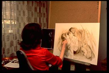
This is a fascinating pictographic story of the creation of cover art from the artist's point of view. She also talks a little about each step.

Here are a couple of highlights, but I recommend looking at each step if you're interested in how some artists go about creating the image they want for the cover.

 Selecting costumes
 Posing models
 Getting the right shot
 Choosing the right shot
 Plan
 Colour
  Final

I'm sure not all artists work the same way, but this is still an interesting window into something most of us only ever see once it's complete.